Friday, February 27, 2009
The spreadsheet I always wanted
GDP figures are out for 2008, while the details have been hotly debated already, I decided to concentrate on something I had long been looking for: gross numbers per sector based on fixed prices, the quarter output is icing on the cake.
I finally found it from the BCV website (be sure to check all tabs)

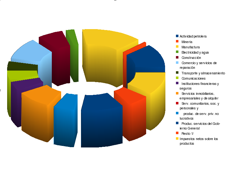
This is how our current GDP looks like in 1997 prices.
And this is how it would look like if in 1997 the price of oil was $40 a barrel instead of $19.
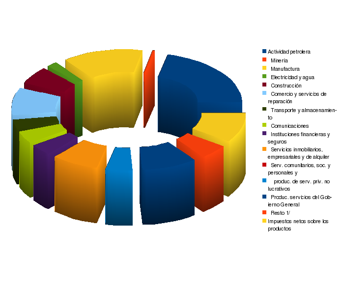
As you can see, manufacturing is a sizable chunk of the economy, while dwarfed by the oil industry most of the time it still represents roughly 60% of it with current prices. I do miss it growing in double digits though, big time.
Another thing to note is how different QI is to QIV, the latter being 20% bigger on certain sectors every year.
|
I finally found it from the BCV website (be sure to check all tabs)
This is how our current GDP looks like in 1997 prices.
And this is how it would look like if in 1997 the price of oil was $40 a barrel instead of $19.
As you can see, manufacturing is a sizable chunk of the economy, while dwarfed by the oil industry most of the time it still represents roughly 60% of it with current prices. I do miss it growing in double digits though, big time.
Another thing to note is how different QI is to QIV, the latter being 20% bigger on certain sectors every year.
|
![]()
